
Lots of people ask what wordpress theme I use. Mostly I use a responsive theme. I use one from Themeforrest called Kallays. Purchase Kallyas Here
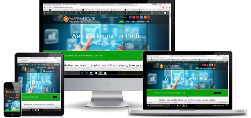
What is a responsive Theme.
A responsive theme is a way to provide your content over a multitude of platforms such as a desktop, laptop, tablet or mobile. You create your content in the normal way however depending on the device it will conform the content to fit.
While you can create your content in a similar way there are some design parameters you need to be aware of to make sure it fits correctly.
1. Images
Visually appealin scalable, large JPEGs are widespread. Aside from hitting mobile users with hundreds of kilobytes of jazzy pixels, consider how your image will appear in 28in widescreen compared with an early iPhone. If it relies on fine details or faint nuances to make sense, it’s no good.
Choose images that jump out at every size. Use the same principles as when designing a logotype; find an idea that works from billboards to pencils.
2. Concise Copy
One benefit of RWD is the increased need for concise copy. Typically, text reflows as boxes and columns narrow, and short text blocks with ample whitespace make for easy changes between layouts. Your copy must fight distractions of work, social media, overflowing inboxes and general boredom. Typical visitors spend little time on each site (see Jakob Nielsen’s research). Be concise and clear; tantalise, hint and hook.
3. Devises
Lots of people in businesses are talking about mobiles and tablets as the new devices that people are viewing your content on. The thing they have missed is that there is a growing number of people looking at your content on TV which means now you have to create content for both small screens and large screens.
This is where a responsive theme for your website is important.
